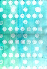
i changed some colors- and put red dots , sky blue color more-as you suggest me to do- what do you think? too many colors?? ah- and color will be little bit different when I print on paper- because my paper color is gray- so it will be changed--
I changed the color composition- what do you think? is it better than before? I just wanna make it like new york's feeling- actually i thought ny is more like colorful like before one- but I also thought too much bright color could be really messy- so I choose little bit dark colors- is it too darky?? i wanna tone down little bit because my composition seems like busy also- what do you think?gen? isn't it little bit too busy? please give me some advices--